Game UI: RPG? Wheel? Stack?
By Weitao Cong
Hi everyone, I’m the UI designer here, and let’s take a look at some fun UI design progress.
As our fellow game devs might already know, developing a good game UI is an essential and thought wracking step in creating a game. It’s important to create an interface that is easy to understand for the players while staying efficient and keeping their attention. Consider our game “The Shadows That Linger” is a narrative gene game, heavily text-based, the dialogue UI would be the top priority.
I have mocked three different dialogue UI and tested two types of them in the engine. Rome wasn't built in one day, to have a deliverable result takes a lot of processes, I will break down each design phase by Functionality, Practicality, Aesthetics, and Simplicity.
Phase 1: The RPG Style
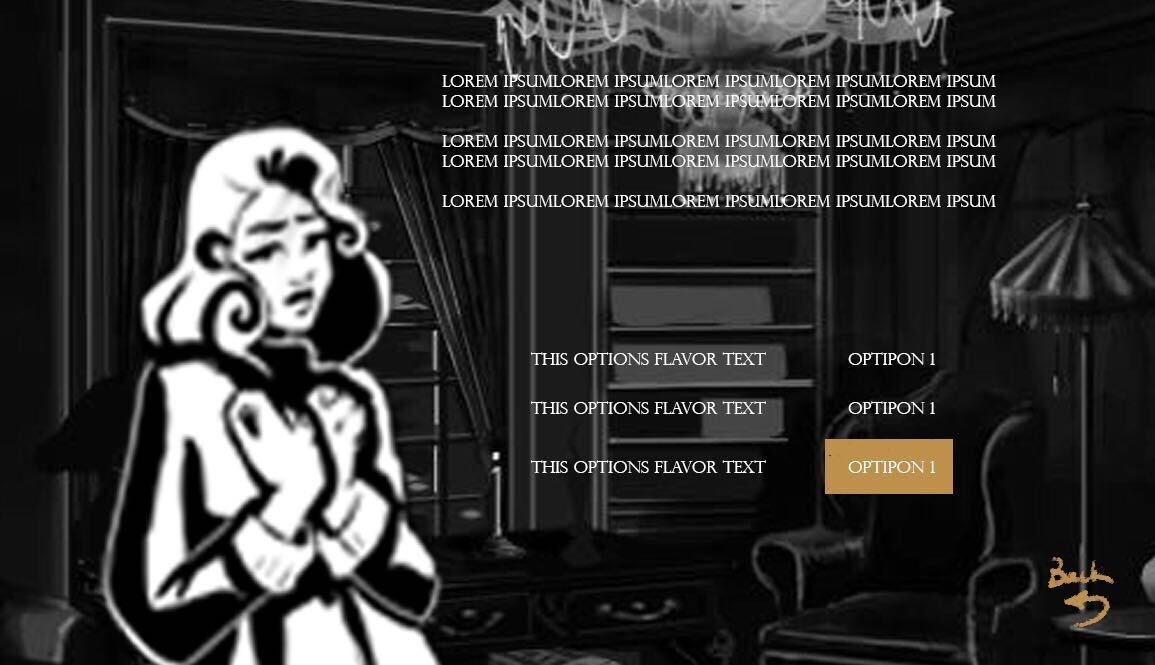
Functionality: Have the character in action on the left and dialogue on the top, decisions below the dialogue, clear for the player to access. The importance is divided equally.
Practicality: Very practical.
Aesthetics: Typical RPG style game dialogue.
Simplicity: All the information is on a single scene, does not require the player to click twice.
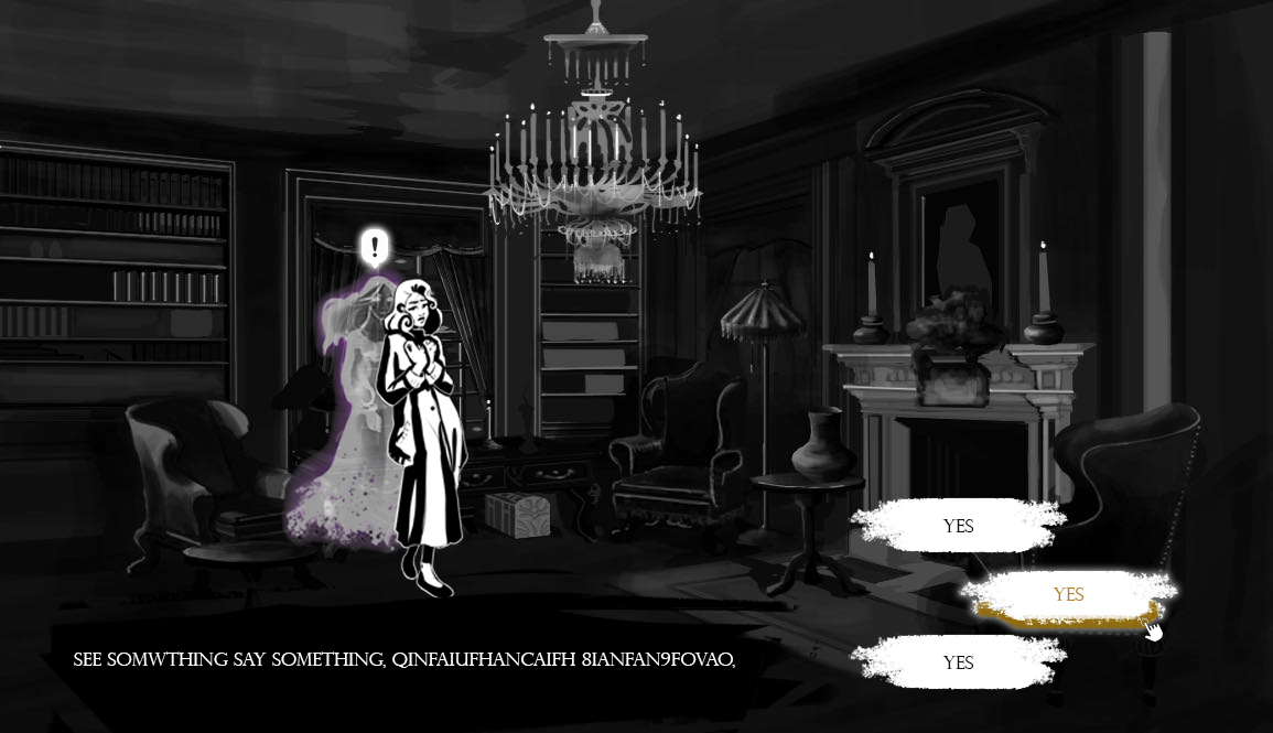
Functionality: Static camera, static character position, the dialogue takes the bottom part of the screen, which leaves ⅓ of the bottom screen to the selection section, make the selections stand out. Because here the selection is the most important UI piece, then the dialogue text shares the secondary importance with the character.
Practicality: Very practical.
Aesthetics: Modified RPG style game dialogue, wider angle.
Simplicity: All the information is on a single scene, does not require the player to click twice.
Phase 2: The Wheel Style
Functionality: Allow the player to focus on one thing at a time, noting will distract your attenuation from making an important decision. But, if you forgot or skip the dialogue, dang, I’m sorry.
Practicality: Just enough.
Aesthetics: Compact wheel style.
Simplicity: Only the choice section, which is more succinct, but it also requires additional clicks to get back to the dialogue.
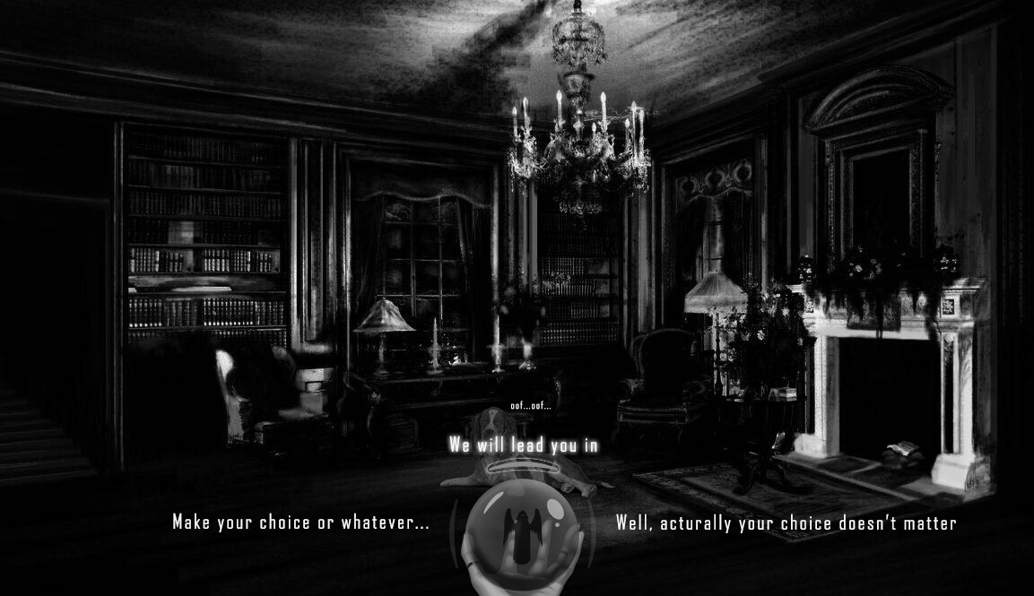
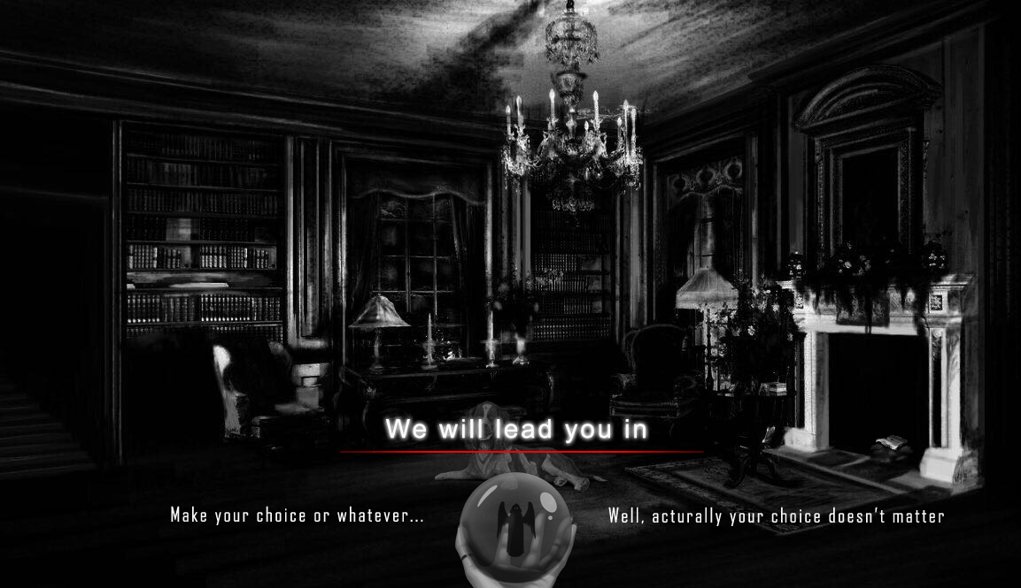
Phase 3: The Stack Style:
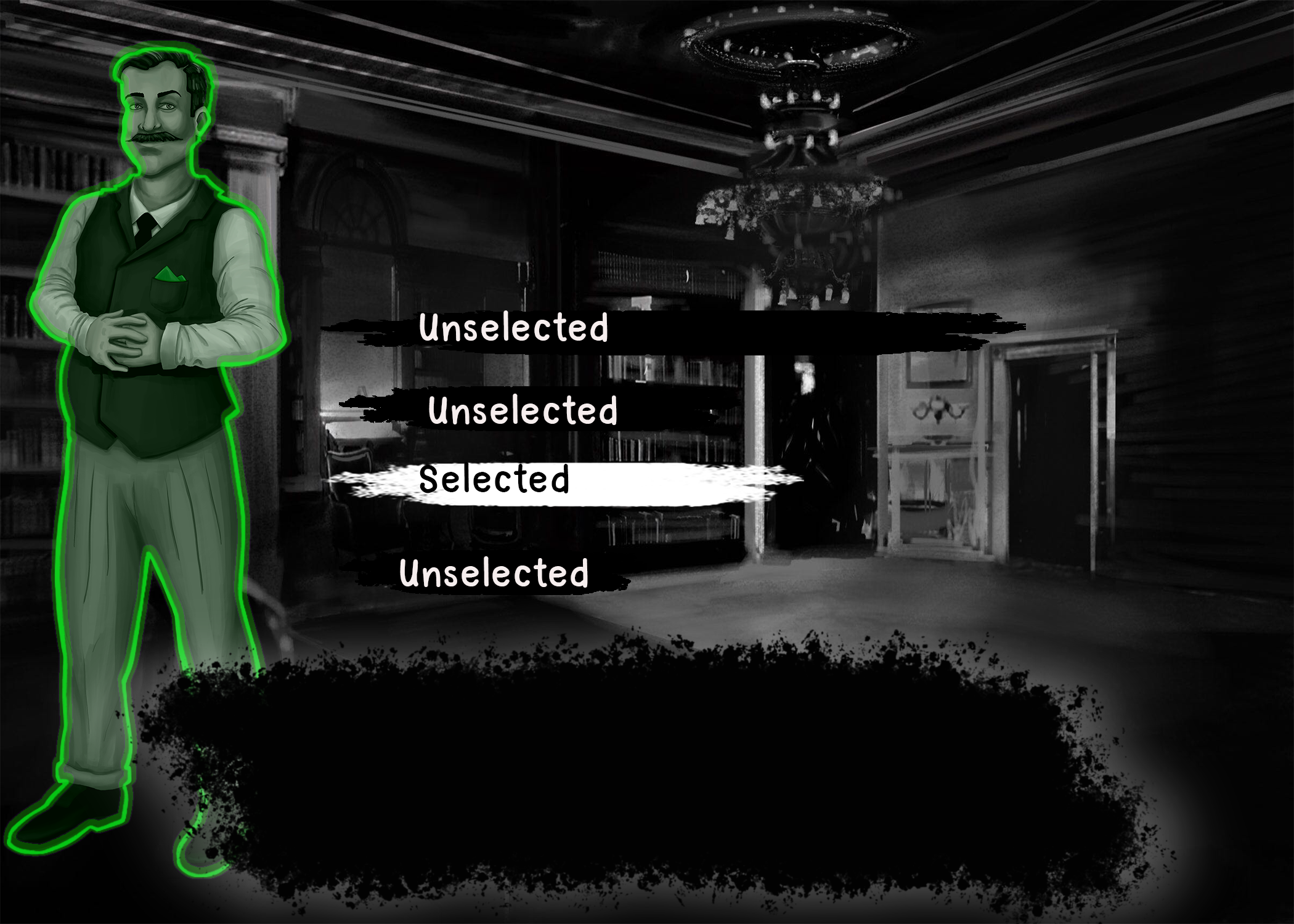
Functionality: Similar to the RPG style, but the dialogue box is on the center bottom of the screen, and the stacked choices take the center part. According to the UI heatmap, the order of importance is center, left to right, top to bottom. The choices section is the most important so we place it on the center, the dialogue text is the second most important UI piece, followed by the UI heatmap principle, it has to be lower than the choice section, so on the bottom center. The player can easily to going over the dialogue while thinking about the decisions.
Practicality: Very practical.
Aesthetics: Compact all in one, similar to the RPG style.
Simplicity: All the information is on a single scene, does not require the player to click twice.
Go through this journey with us and if you have any suggestions leave a comment or contact us on social media, peace!
Leave a comment
Log in with itch.io to leave a comment.